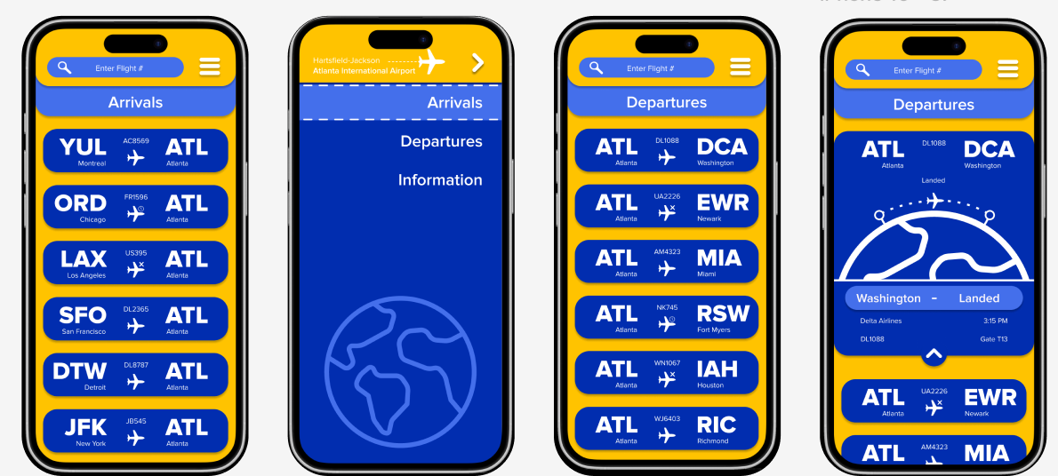
The Intention
The goal of this project is to make an app that allows a user to track a flight within Atlanta Airport easily,
whether the user is an experienced traveler or a first-time flyer
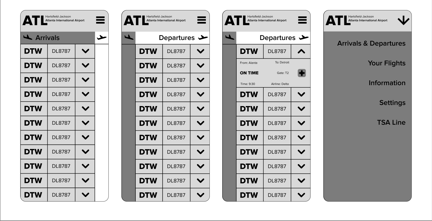
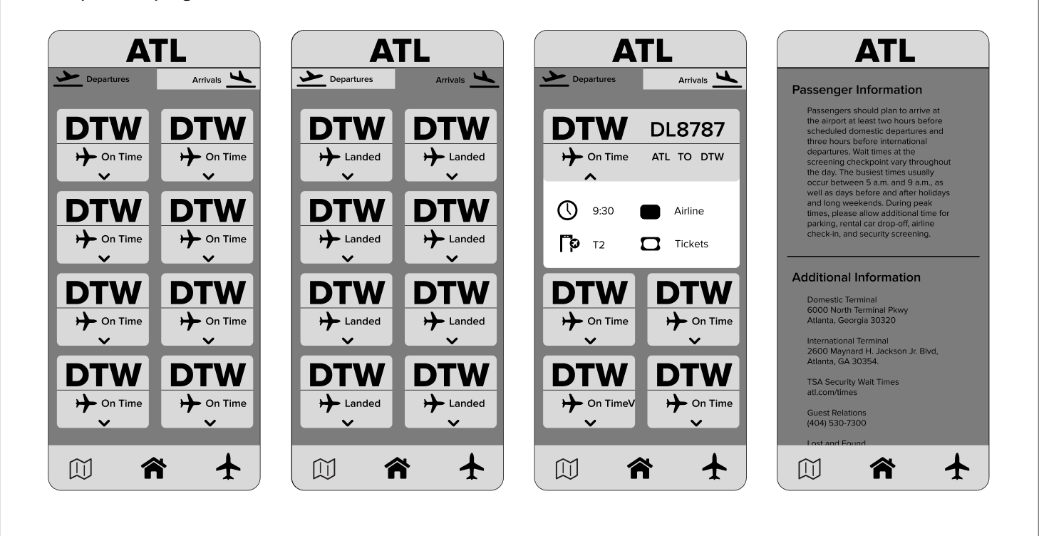
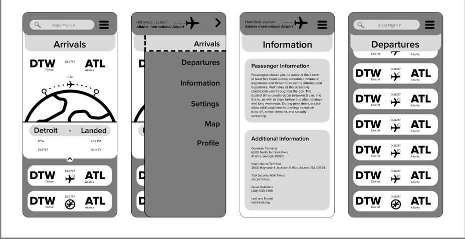
Ideation
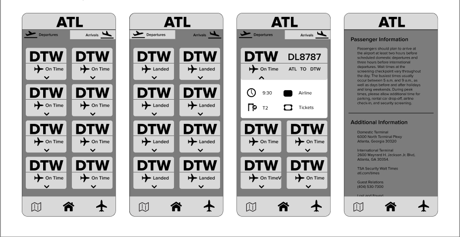
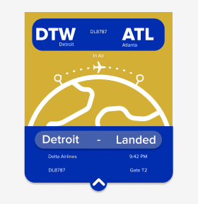
Moving on from the base sketches and initial color palette decision, I wanted the buttons (the app's main interaction) to feel playful and provide all the information someone might need without feeling overwhelming.
Color Palette
I wanted to make my colors have a representation of the airport, so I decided to use the colors of the
city of Atlanta itself for the palette, making some small changes to make them pop more.

Widget Development
Moving on from the base sketches and initial color palette decision I wanted the buttons, which were the main interaction of the app, to feel playful and provide all the information someone could need and use without feeling overwhelming
Final
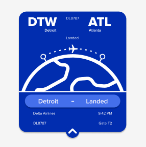
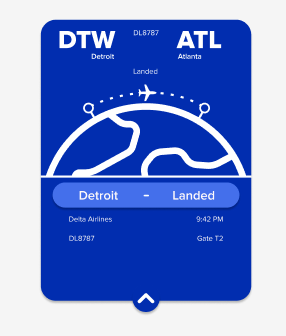
The final version of my app ui/ux made use of a more saturated version of my color palette, along with a focus on ease of use and not being overwhelming to a new user. I also made a symbol for every single status a flight could have. This design could be used by anyone, regardless of their level of air travel experience.